Nerdwallet started as the go-to site to find a new credit card and expanded to a broader audience by helping people answer a range of financial questions. The main issue with being a destination is that people would only visit NerdWallet when they had a question. We weren’t doing enough to meet people where they were and surface potential issues before they became a financial problem.
We needed to make a product that would build a lasting relationship with our users so that we could be there when users have a question and suggest ways they could improve. We started by focusing on the user’s credit score as it underlies almost every large financial decision. After pitching this product, a Product Manager and I got the green light to assemble a team of two engineers to build out the first version.
To kick off this project we ran a design sprint, similar to the way Google runs theirs. We had a User Researcher, Product Manager, and Engineers in the room. We brought in our experts on credit score to give us an overview. We looked at competitors to see what they were doing well and identified what we could improve. We then built a rough wireframe prototype for user testing.
Through testing, we learned that the main problems with credit score were that people didn't understand what makes up a credit score and they didn't know how to improve it.
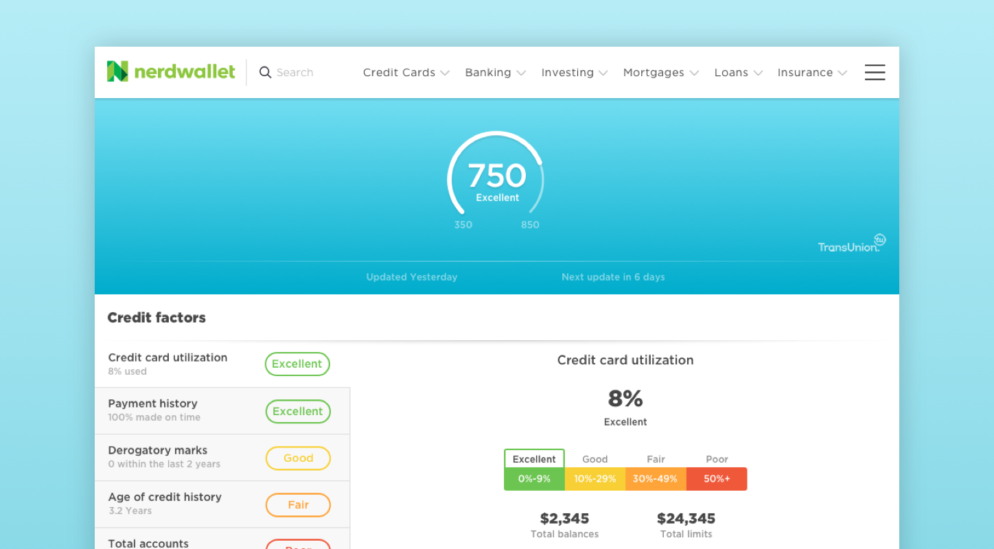
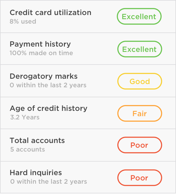
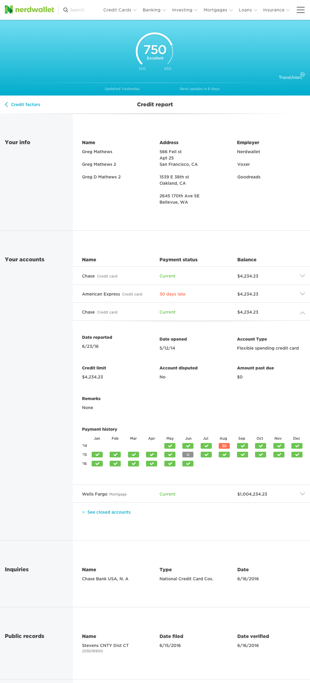
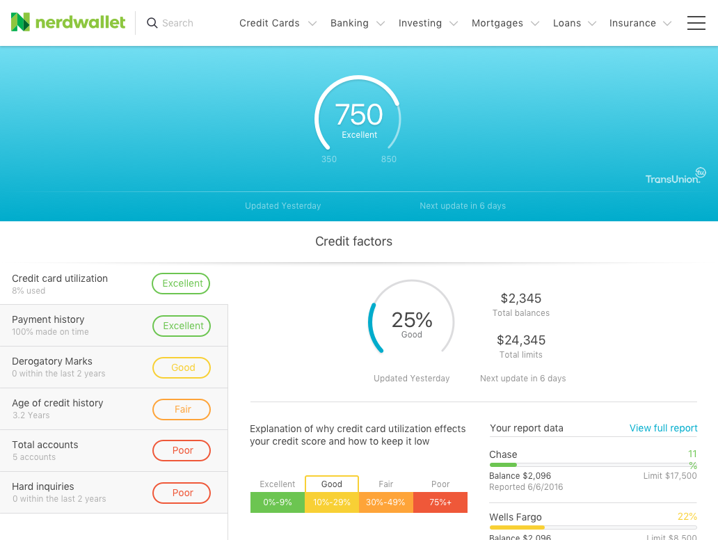
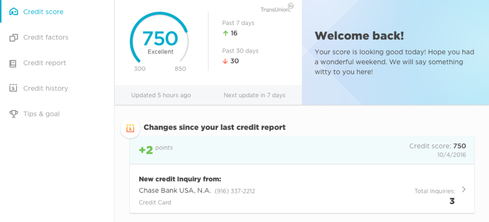
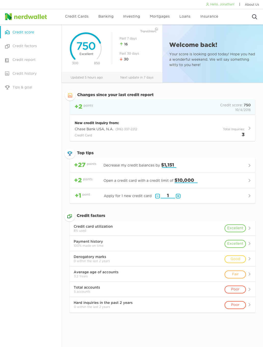
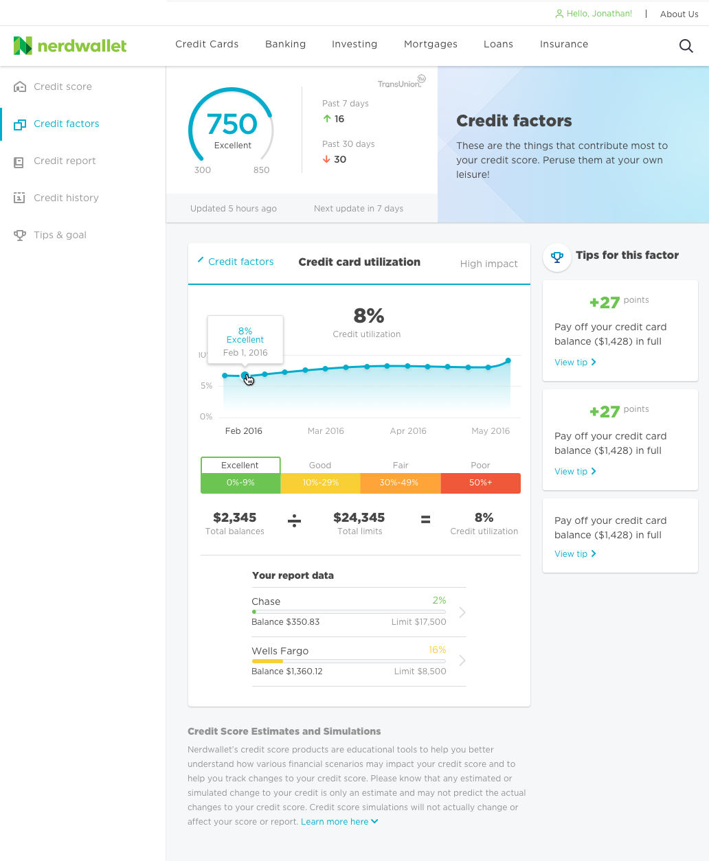
The UI focused on the six main factors that contribute to credit score. We ordered the factors by most impactful to least, and included an overview of how the user was performing so they could quickly understand where they need to focus to improve. In addition to this, we included explanations of what the factors were and additional articles to further educate the users.
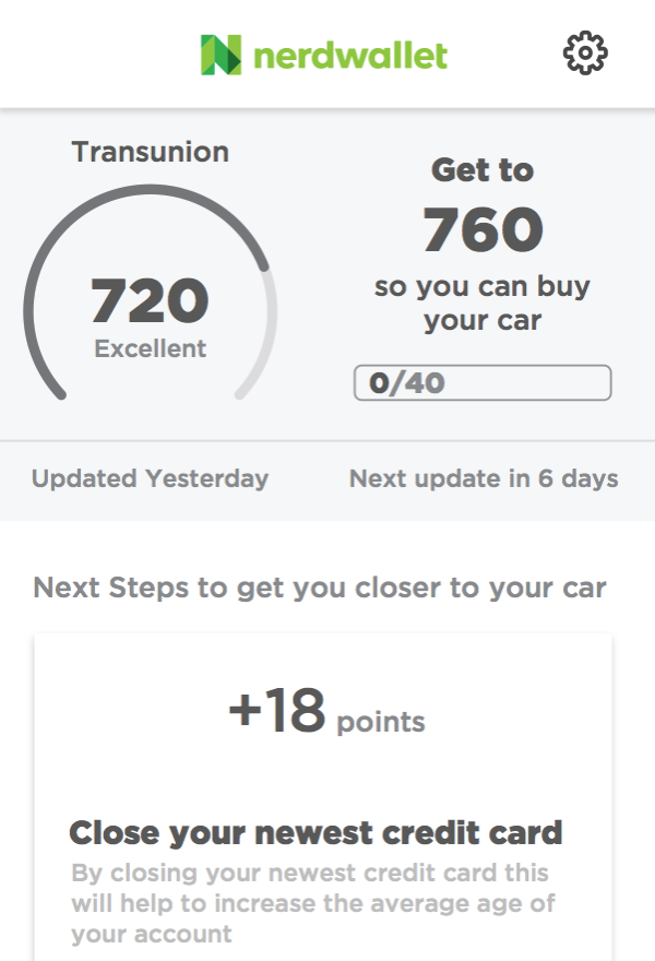
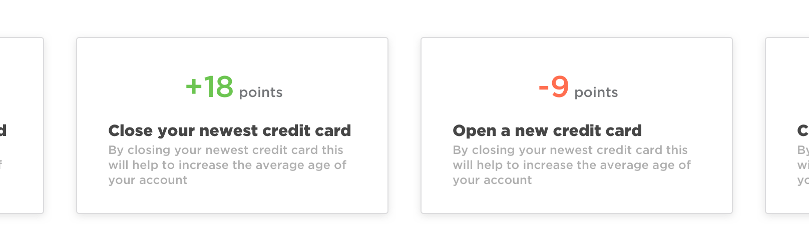
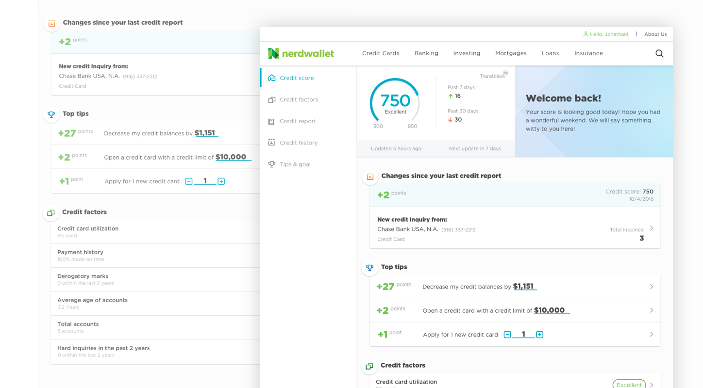
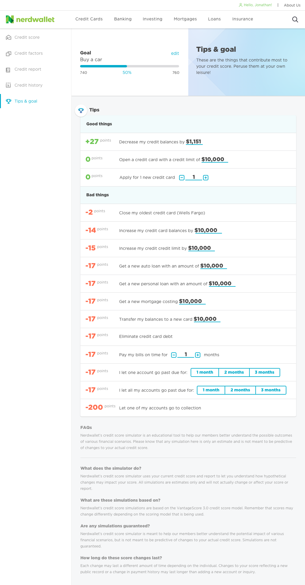
One of the biggest competitor learnings we gathered was the fact that nobody told you how to improve your credit score. The third party API we were using had a credit score simulator, but users had to proactively try and guess what might improve their score.
We flipped this around and proactively selected numbers that would most likely increase people's scores, ran the simulations for them, and presented them with the results. This ended up giving people actionable insights and ways they could increase their score.
In a quarter we were able to grow from 5k users to ~150k users. We proved that credit score was something that people were extremely interested in and that they were interested in proactive ways to improve their situation.